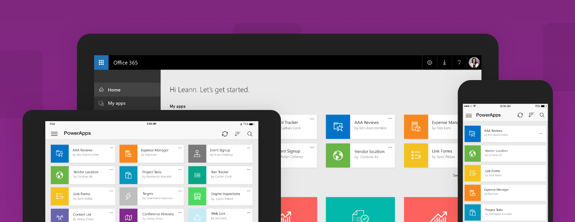
PowerApps needed an experience system that meets the needs of a feature rich client based application but also aligns to the the web based portal, which utilizes a different grid system and is implemented by a separate engineering team. The problem involved several steps. First, was the visual design of the framework documentation. Second step was designing the structure of how the framework content would be classifed. And most importantly, the UI and UX needed to be developed to fill the templates that were created
Designing a system for a system
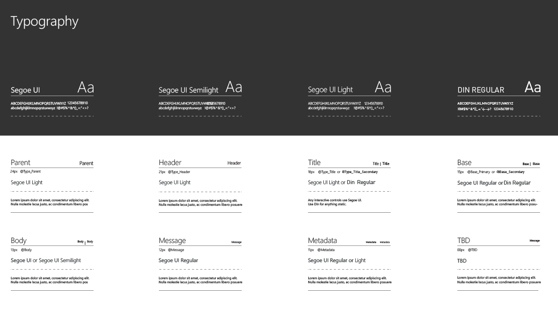
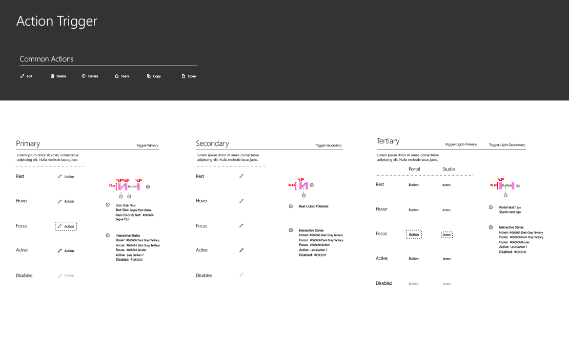
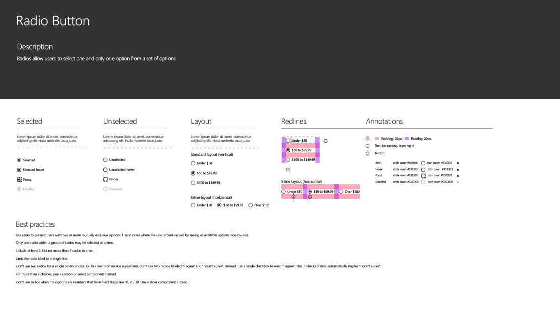
I Began with designing a card that would hold the information associated with each category of the framework. The main categories were color, typography, grid, & controls. Each category was then divided into sub categories. Each subcategory would be placed into the card that was designed. This was, essentially, a pattern for the patterns.
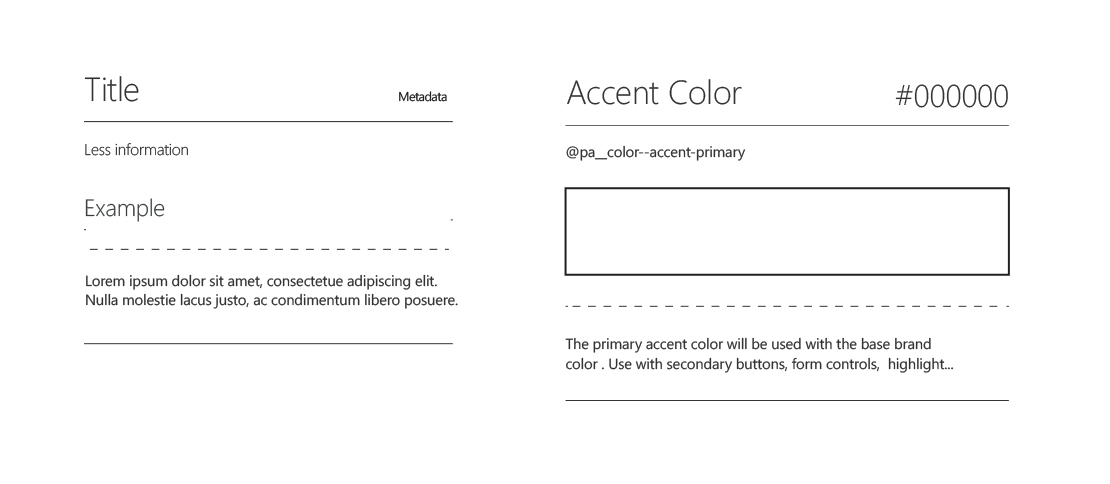
Next up was designing a system to hold the pattern cards. I got to work on a grid that was flexible enough to allow for larger and more complex patterns. This grid was a 12 column with 4 px horizontal grid & fluid areas for examples, headers, & redlines.
The results
A dynamic but consistant system. Goal was to create an experience that would allow devs, designers, & management teams members to clearly & quickly parse the library.
Form controls, base level modular UI
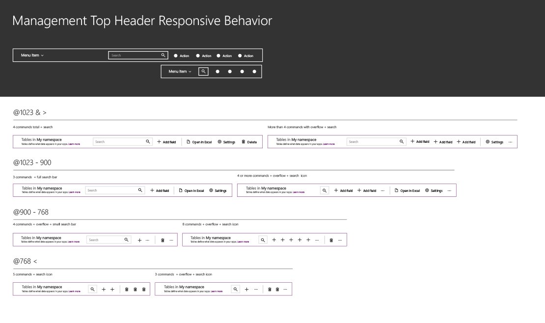
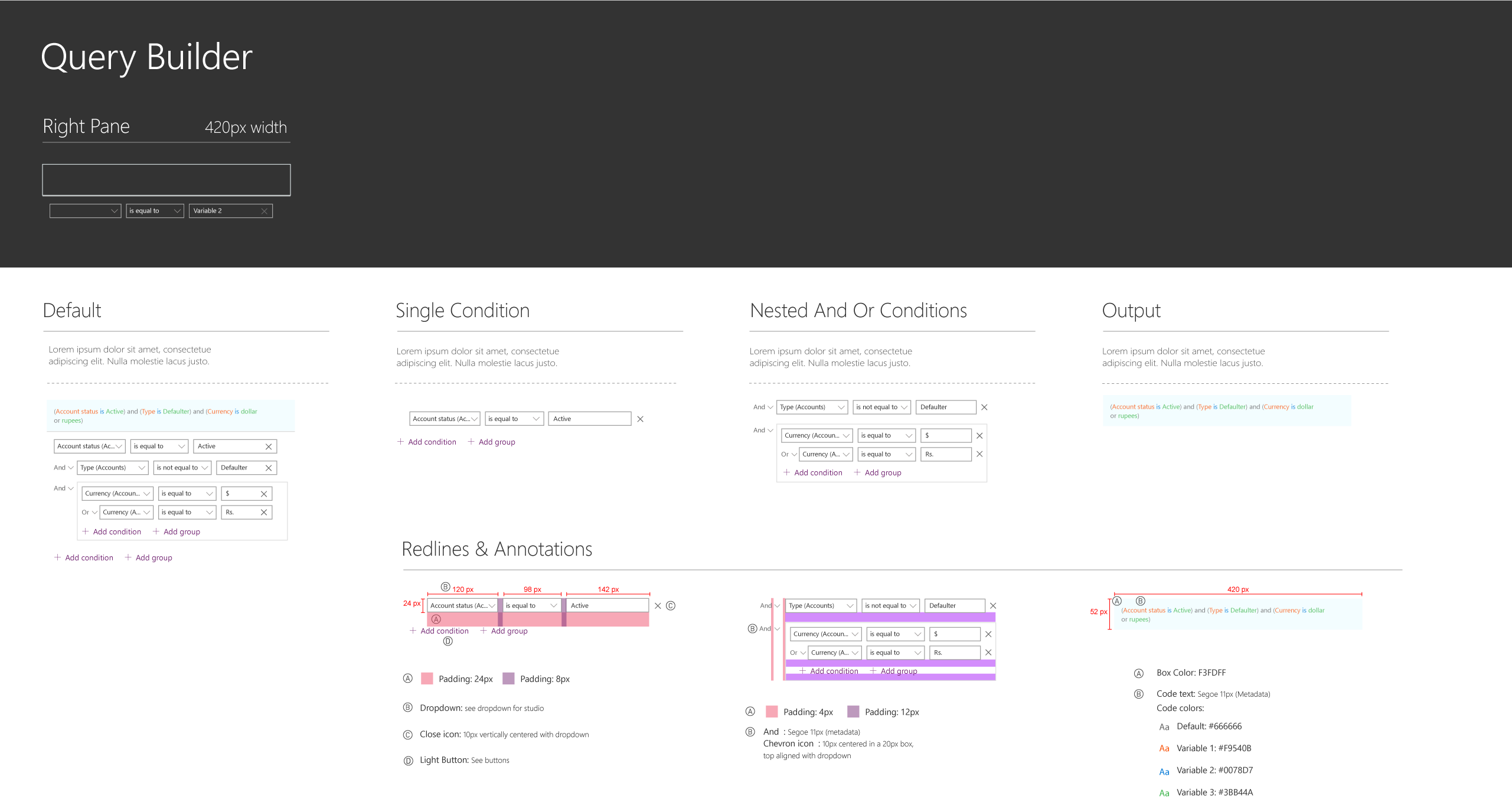
More complex product interactions
GA will ship in October and designs will be more clear.